Designing Mobile-Friendly Email Campaigns
In today’s digital age, it’s essential for businesses to have a mobile-friendly presence. With the majority of people accessing their emails on smartphones and tablets, designing email campaigns specifically for mobile devices is crucial for reaching and engaging with your audience effectively. In this article, we’ll explore the best practices for designing mobile-friendly email campaigns that will drive engagement and conversions.
1. Responsive Design
One of the most important aspects of designing a mobile-friendly email campaign is using responsive design. Responsive design ensures that your email will adapt to various screen sizes, making it easy to read and navigate on any device. By using responsive design, you can create a seamless experience for your subscribers, increasing the chances of them engaging with your content.
2. Clear and Concise Content
When designing a mobile-friendly email campaign, it’s important to keep your content clear and concise. Mobile users are often on the go, so they don’t have time to read long paragraphs of text. Make sure your content is easy to scan and understand at a glance. Use short paragraphs, bullet points, and headers to break up the text and make it more digestible.
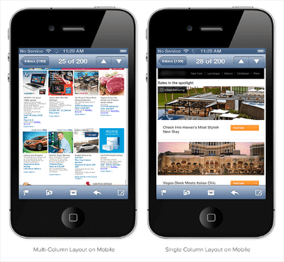
3. Use a Single Column Layout
Another key aspect of designing mobile-friendly email campaigns is using a single column layout. Single-column layouts work best on mobile devices because they are easy to read and navigate. Avoid using multiple columns or complex layouts that can be difficult to view on smaller screens. Keep your design simple and focused on the most important content.
4. Use Large Fonts and Buttons
Mobile devices have smaller screens than desktop computers, so it’s important to use large fonts and buttons in your email campaigns. Make sure your text is easy to read and your call-to-action buttons are easily clickable. By using large fonts and buttons, you can make it easier for your subscribers to engage with your content and take action.
5. Optimize Images for Mobile
Images are a powerful tool in email marketing, but they can also slow down load times on mobile devices. To ensure your email campaigns load quickly and look great on mobile, optimize your images for mobile devices. Use compressed images and avoid large file sizes that can slow down load times. Additionally, make sure your images are relevant and add value to your content.
6. Test Your Campaigns
Before sending out your mobile-friendly email campaigns, it’s crucial to test them on various devices and email clients. Testing your campaigns will help you ensure that they look great and function properly on different screens and platforms. Use email testing tools to check for responsiveness, load times, and overall usability. By testing your campaigns, you can identify and address any issues before they reach your subscribers.
Conclusion
Designing mobile-friendly email campaigns is essential for engaging with your audience and driving conversions. By using responsive design, clear and concise content, single-column layouts, large fonts and buttons, optimized images, and thorough testing, you can create effective email campaigns that provide a seamless experience for your subscribers on mobile devices. Follow these best practices to design mobile-friendly email campaigns that will help you reach and connect with your audience wherever they are.